About me
About me
About me
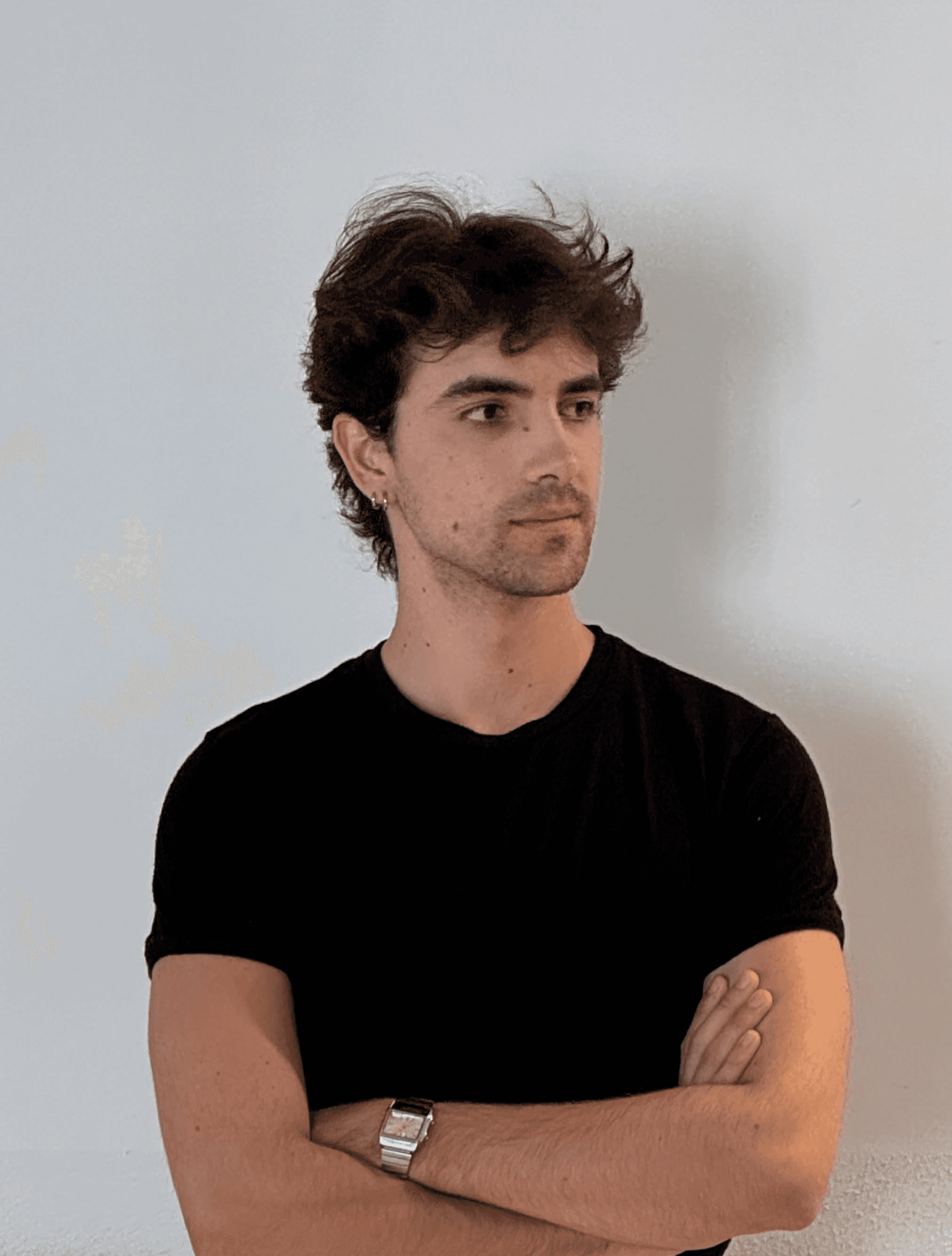
I’m Ivan, a brand designer and consultant based in Madrid. Over the past five years, I’ve worked across different areas of design: from WANNA, an award-winning studio focused on storytelling, interior design and branding, to Erretres, one of Spain’s most renowned consulting firms.
I’ve worked with major national companies such as Repsol, Santalucía Insurance, ISDIN and Santander Bank, as well as international startups like Grenergy, Seedtag and Zena.
I approach branding from a global perspective, understanding how strategy, design, technology and business need to be interconnected in order to build solid result-driven propositions that keep brands relevant.
Let's work together!
I’m Ivan, a brand designer and consultant based in Madrid. Over the past five years, I’ve worked across different areas of design: from WANNA, an award-winning studio focused on storytelling, interior design and branding, to Erretres, one of Spain’s most renowned consulting firms.
I’ve worked with major national companies such as Repsol, Santalucía Insurance, ISDIN and Santander Bank, as well as international startups like Grenergy, Seedtag and Zena.
I approach branding from a global perspective, understanding how strategy, design, technology and business need to be interconnected in order to build solid result-driven propositions that keep brands relevant.
Let's work together!
I’m Ivan, a brand designer and consultant based in Madrid. Over the past five years, I’ve worked across different areas of design: from WANNA, an award-winning studio focused on storytelling, interior design and branding, to Erretres, one of Spain’s most renowned consulting firms.
I’ve worked with major national companies such as Repsol, Santalucía Insurance, ISDIN and Santander Bank, as well as international startups like Grenergy, Seedtag and Zena.
I approach branding from a global perspective, understanding how strategy, design, technology and business need to be interconnected in order to build solid result-driven propositions that keep brands relevant.
Let's work together!
work experience
Jan 2026 / Now
Apr 2024 / Nov 2025
Nov 2021 / Oct 2023
languages
Native
Spanish · French
Full professional proficiency (C2)
English · Catalan
Basic
Korean
Tools
AI
Chat GPT, Claude, Gemini, Runway, Midjourney, Visual Electric.
Adobe
Photoshop, Illustrator, InDesign, After Effects.
Others
Figma, Framer, Jitter, Mailchimp.
academic background
Double degree in Design & Technology
Cultural exchange in South Korea (1 year)
Rotary Youth Exchange in 충청남도
Science Baccalaureate
Dénia, Alicante
Rumour has it…
During the nearly two years I worked with Ivan, he grew from an intern into a true asset within the Erretres design team, a testament to the energy and motivation he brings to the table.
He is skilled in the entire design process, from research to ideation and implementation, and offers a series of other soft skills such as technical knowledge and impeccable organisation.
He is meticulous and talented in his work whilst still being able to collaborate harmoniously with other designers, an ease of adaptation which, combined with his desire for constant learning, I’m sure will serve him well as he joins new teams and faces new challenges.
Ivan is not only a designer hungry for challenges and full of talent; he is someone who builds team spirit beyond the projects themselves.
With an exceptional sensitivity for selecting references and visual resources, the drive and curiosity to solve problems, and a genuine interest in strengthening a business vision, he is perfectly suited to grow within the field of brand creation.
Ivan no solo es un diseñador hambriento de retos y lleno de talento; es una persona que hace equipo más allá de los proyectos.
Con una sensibilidad extraordinaria para la elección de referencias y recursos visuales, la inquietud y curiosidad para resolver problemas y un interés por potenciar la visión de negocio, es un perfil perfecto para desarrollarse dentro del campo de la creación de marcas.
Ivan’s work shows a deep understanding of the cultural, aesthetic and symbolic references that give meaning to contemporary design.
At Erretres, he has brought a refined and demanding perspective, elevating each project through visual decisions that combine intuition, rigour and meaning. He has that rare ability to connect conceptual with emotional, and strategic with beautiful.
His way of working conveys strong judgement and a genuine commitment to quality. A designer with a voice of his own and an inspiring perspective.
El trabajo de Ivan demuestra una profunda comprensión de las referencias culturales, estéticas y simbólicas que dan sentido al diseño contemporáneo.
En Erretres ha sabido aportar una mirada refinada y exigente, elevando cada proyecto con decisiones visuales que combinan intuición, rigor y significado. Tiene esa rara capacidad de conectar lo conceptual con lo emocional, lo estratégico con lo bello.
Además, su forma de trabajar transmite criterio y un compromiso real con la calidad. Un diseñador con voz propia y una mirada que inspira.
For me, Ivan goes far beyond the label of designer. He is a multifaceted creative, meticulous, with deep analytical capacity and a sense of judgement that consistently enriches every project.
He shines particularly in branding, but also in the conceptualisation of brand experiences.
It has been a real pleasure to work with him, because of his commitment, his craft and the calm he brings to working teams.
He is one to watch for.
Thank you always, Ivan <3
Para mí, Ivan trasciende con creces la etiqueta de diseñador. Es un creativo polifacético, meticuloso, con una profunda capacidad de análisis y un criterio que siempre enriquecen los proyectos.
Brilla especialmente en el branding, pero también en la conceptualización de experiencias de marca.
Ha sido un gustazo trabajar con él, por su implicación, buen hacer y por la calma que aporta a los grupos de trabajo. Dará que hablar. ¡Gracias siempre, Iván! <3
WORK
WORK
WORK
Grenergy
Grenergy
2025 · DESIGNED AT ERRETRES
2025 · DESIGNED AT ERRETRES
2025 · DESIGNED AT ERRETRES
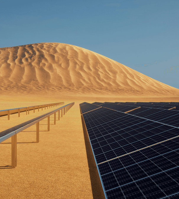
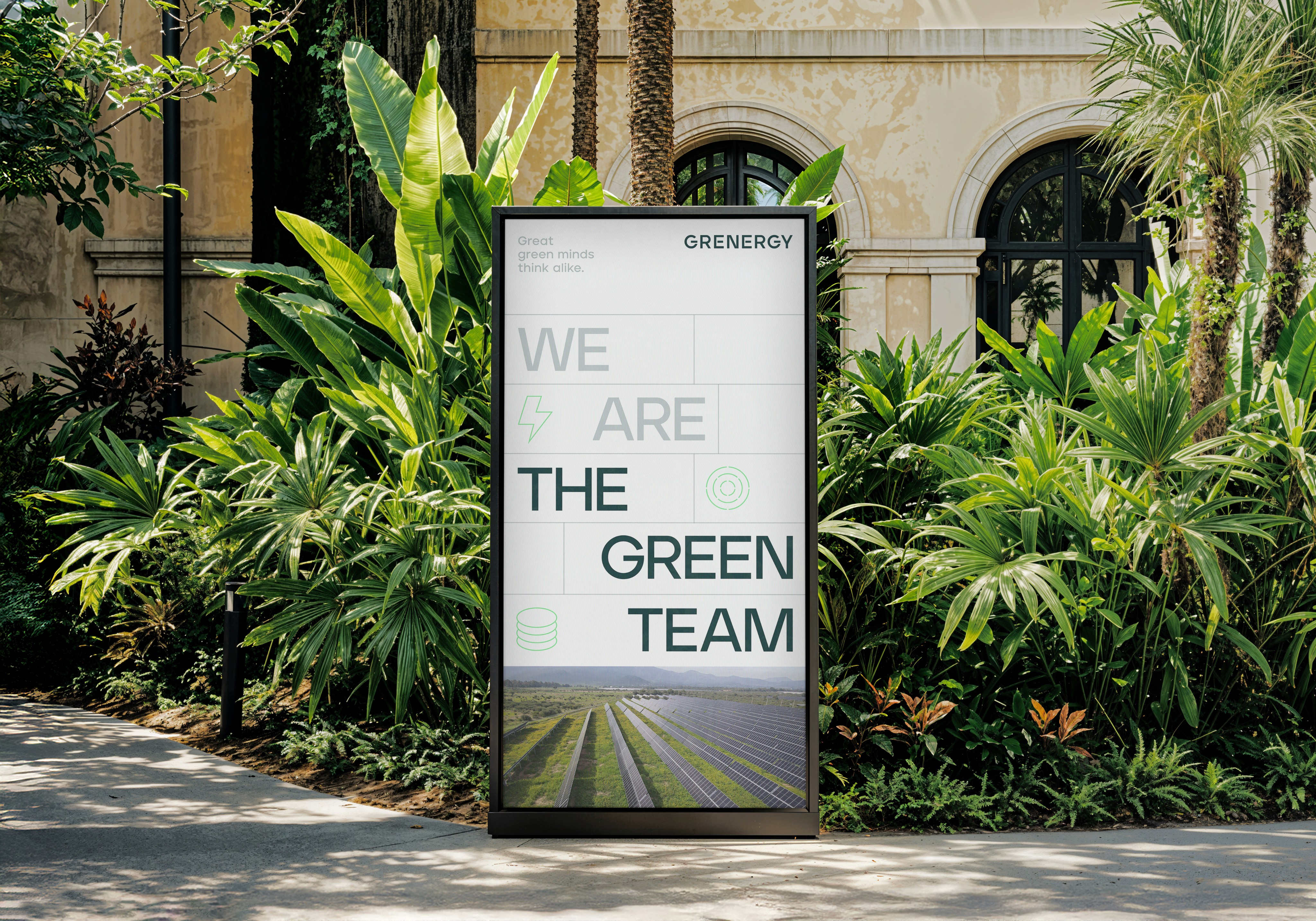
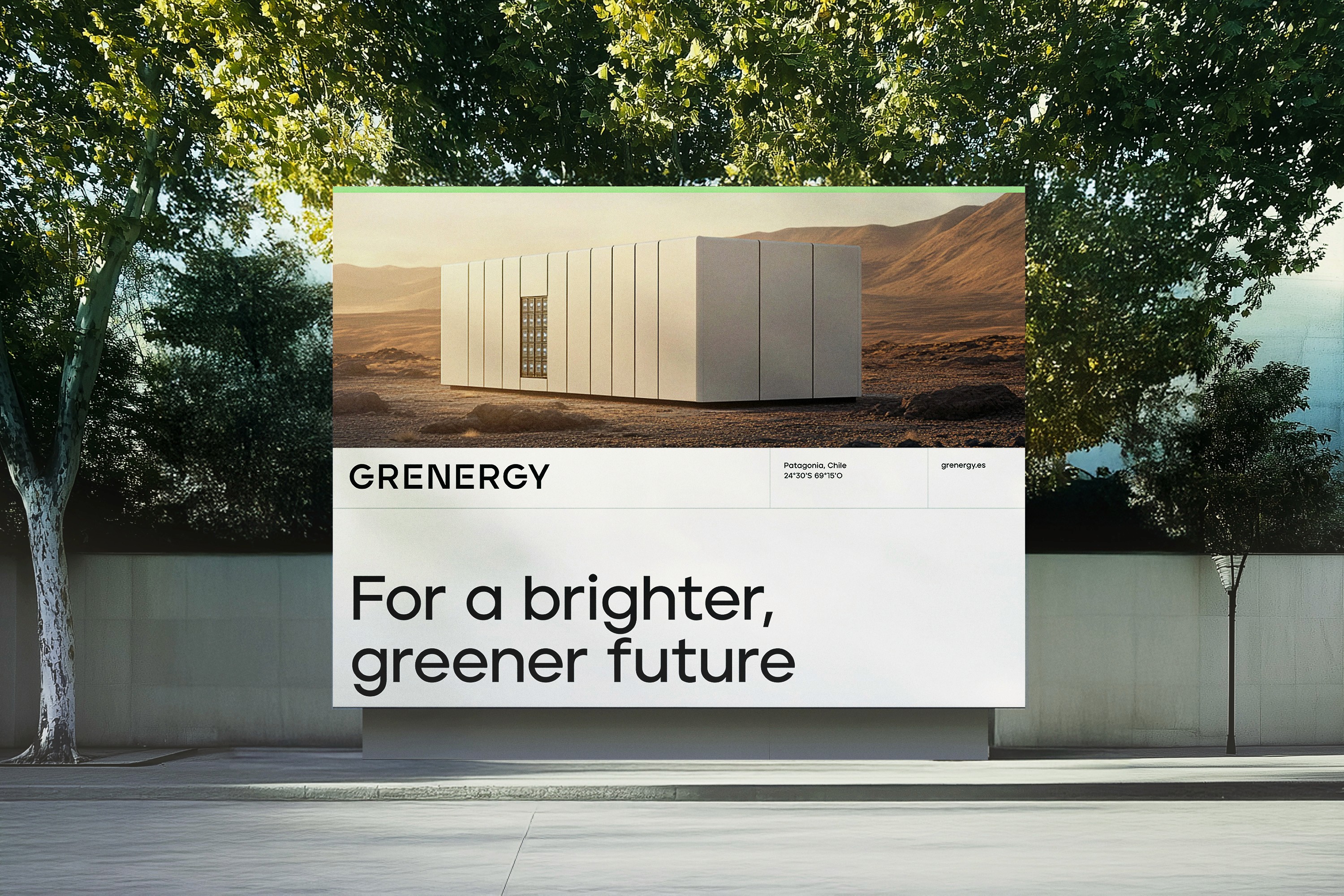
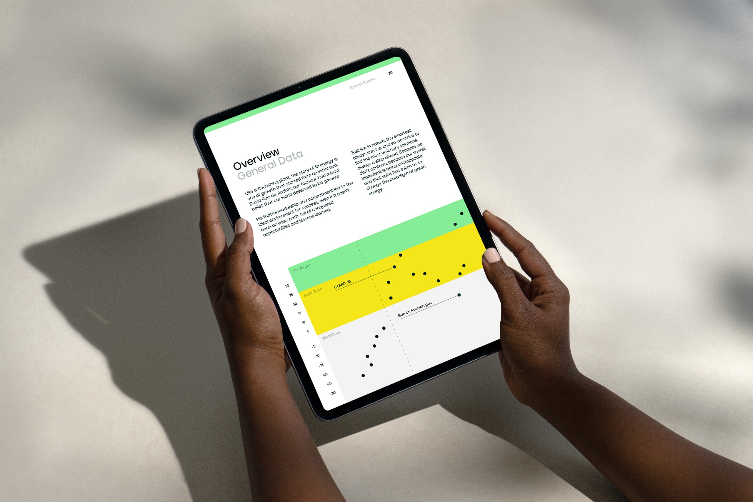
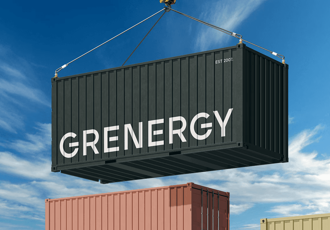
Grenergy leads the renewable energy sector, but its previous identity did not reflect its positioning nor its growth ambitions.
Throughout the project, I was involved across every phase: from brand audit, benchmarking and analysis, reference exploration, visual paths definition and the development of the new identity.
I was also involved in preparing presentations, producing and finalising assets, developing brand guidelines, and supporting the brand guardianship phase, working alongside their internal design teams to ensure the brand was implemented correctly.
Grenergy lidera el sector de las energías renovables, pero su identidad anterior no reflejaba ni su posicionamiento ni su ambición de crecimiento.
Durante el proyecto participé de forma transversal en todas las fases: desde la auditoría de marca, benchmarking y análisis, hasta la exploración de referencias, definición de caminos visuales y desarrollo de la nueva identidad.
También estuve involucrado en la preparación de presentaciones, producción y artefinalizado de piezas, manualización, así como en la fase de brand guardianship, dando soporte a los equipos internos de diseño para garantizar una correcta implementación de la marca.




Accem
Accem
2026 · DESIGNED AT ERRETRES
2026 · DESIGNED AT ERRETRES
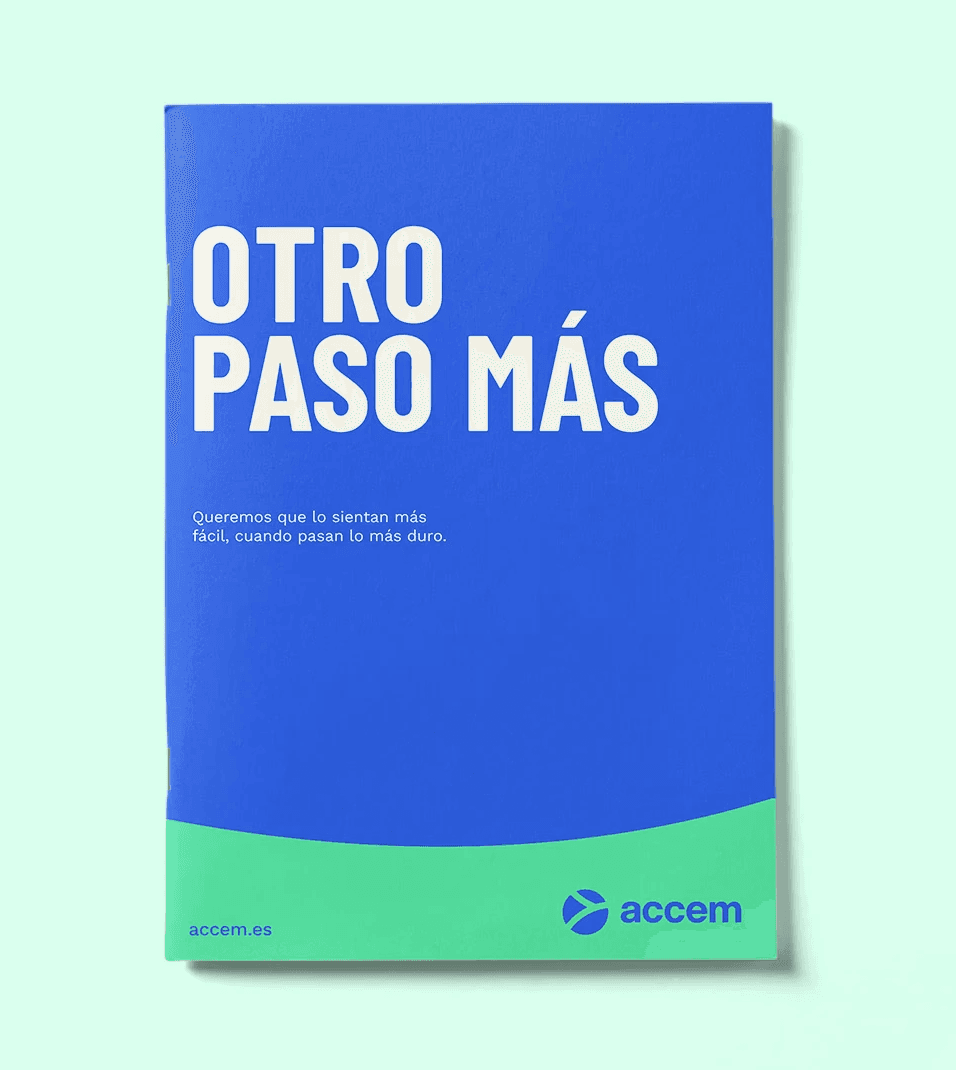
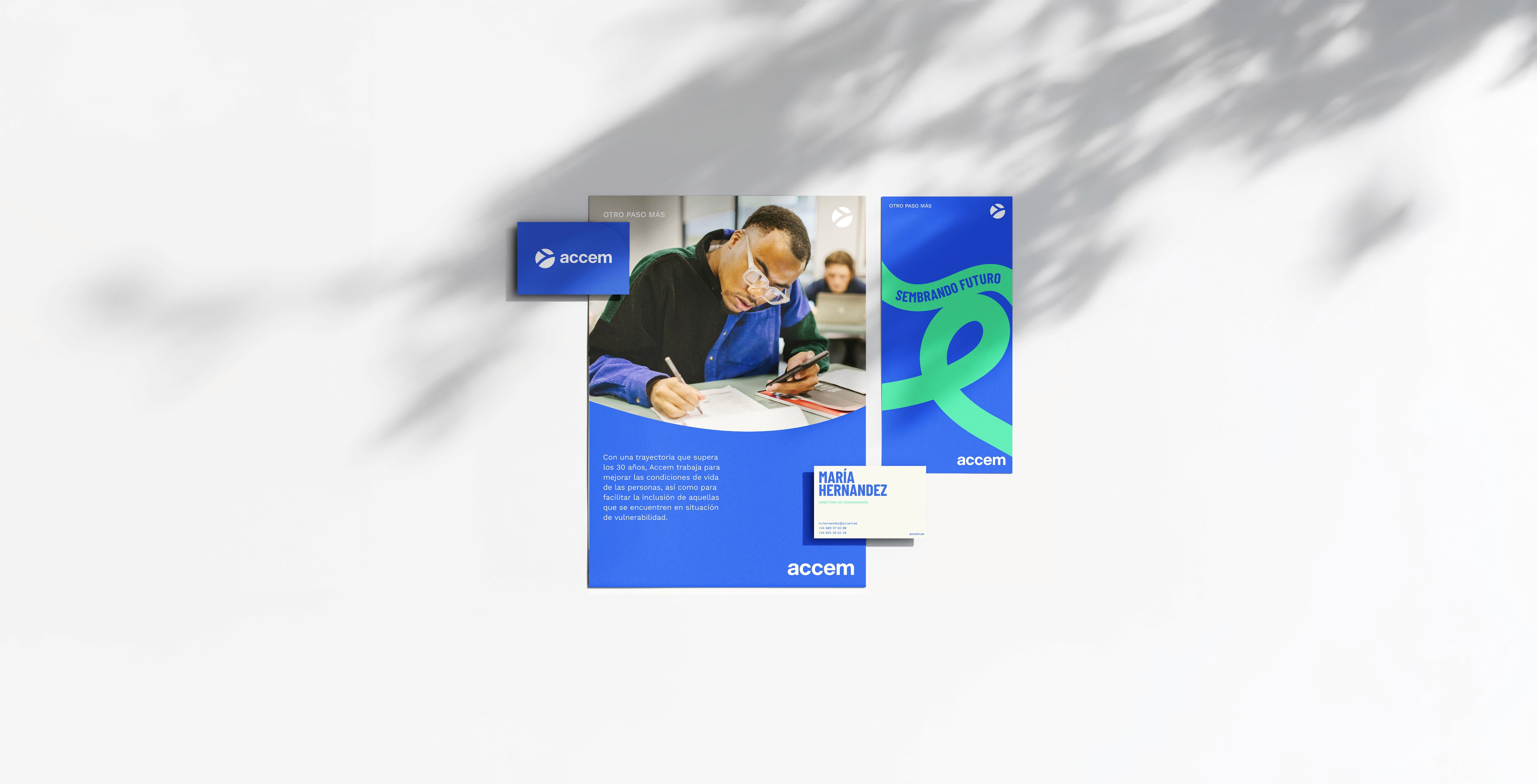
Accem is a non-profit organisation working to improve living conditions and rights of people in vulnerable situations.
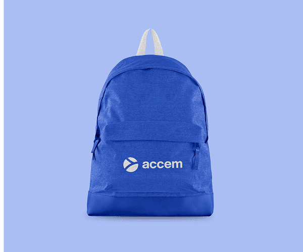
Founded in 1990, it's created a positive impact for more than 35 years. However, its underdeveloped brand meant it was often overlooked. To change this, we developed a brand strategy and visual identity that felt close, humble and timeless, helping the organisation achieve greater brand recognition.
Throughout the project, I was actively involved in research, analysis and benchmarking, reference exploration, visual routes, identity definition, asset development, brand guidelines and final artwork.
Accem es una organización sin ánimo de lucro que trabaja para mejorar las condiciones de vida y defender los derechos de las personas en situación de vulnerabilidad.
Fundada en 1990 lleva más de 35 años generando impacto positivo en la sociedad, sin embargo su marca poco trabajada causaba que cayese en el olvido. Para cambiar esto desarrollamos una estrategia de marca e identidad visual cercana, humilde y atemporal para así conseguir un mayor reconocimiento de marca.
Durante el proyecto participé activamente en: investigación, análisis y benchmarking, búsqueda de referencias, caminos visuales, definición de identidad, desarrollo de piezas, manualizado y AAFF.

Ultratecno
Ultratecno
2026 · DESIGNED AT ERRETRES
2026 · DESIGNED AT ERRETRES
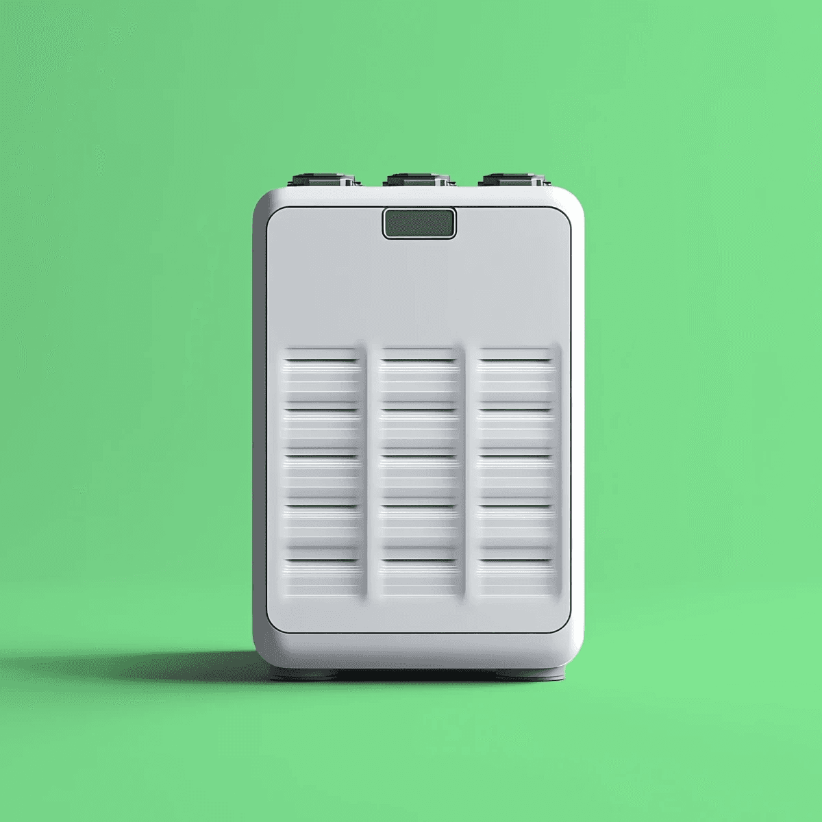
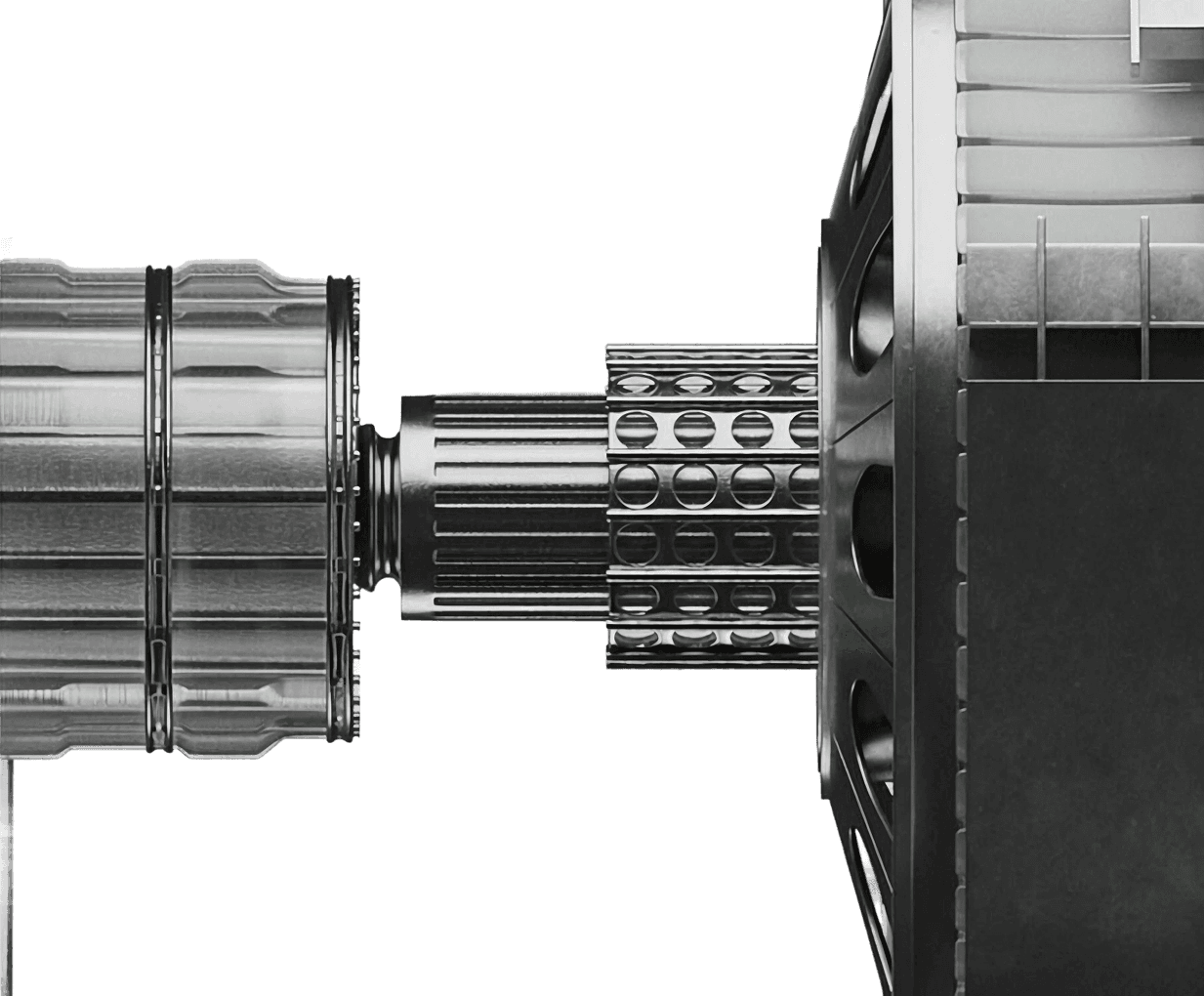
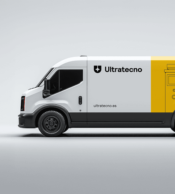
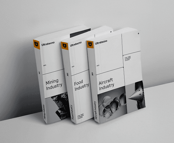
Ultratecno is a Valencian company specialized in the design and manufacture of ultrasonic cleaning equipment. In order to expand its market share, the company needed a brand that reflected its expertise and positioned it alongside its main international competitors.
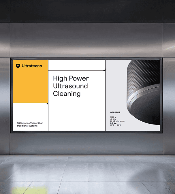
The identity we developed takes a contemporary, industrial approach. We drew inspiration from the cavitation process and the microbubbles it generates to create a “liquid” graphic language, present throughout the visual system through a series of subtle references, from the iconography and logotype to more editorial applications.
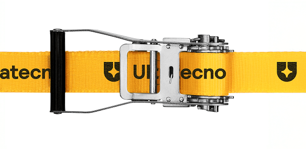
In this project, I was involved in expanding the graphic language, producing branded assets, creating mockups, developing brand guidelines, preparing presentations and final artwork.
Ultratecno is a Valencian company specialized in the design and manufacture of ultrasonic cleaning equipment. In order to expand its market share, the company needed a brand that reflected its expertise and positioned it alongside its main international competitors.
The identity we developed takes a contemporary, industrial approach. We drew inspiration from the cavitation process and the microbubbles it generates to create a “liquid” graphic language, present throughout the visual system through a series of subtle references, from the iconography and logotype to more editorial applications.
In this project, I was involved in expanding the graphic language, producing branded assets, creating mockups, developing brand guidelines, preparing presentations and final artwork.

Repsol
Repsol
2025 · DESIGNED AT ERRETRES
2025 · DESIGNED AT ERRETRES
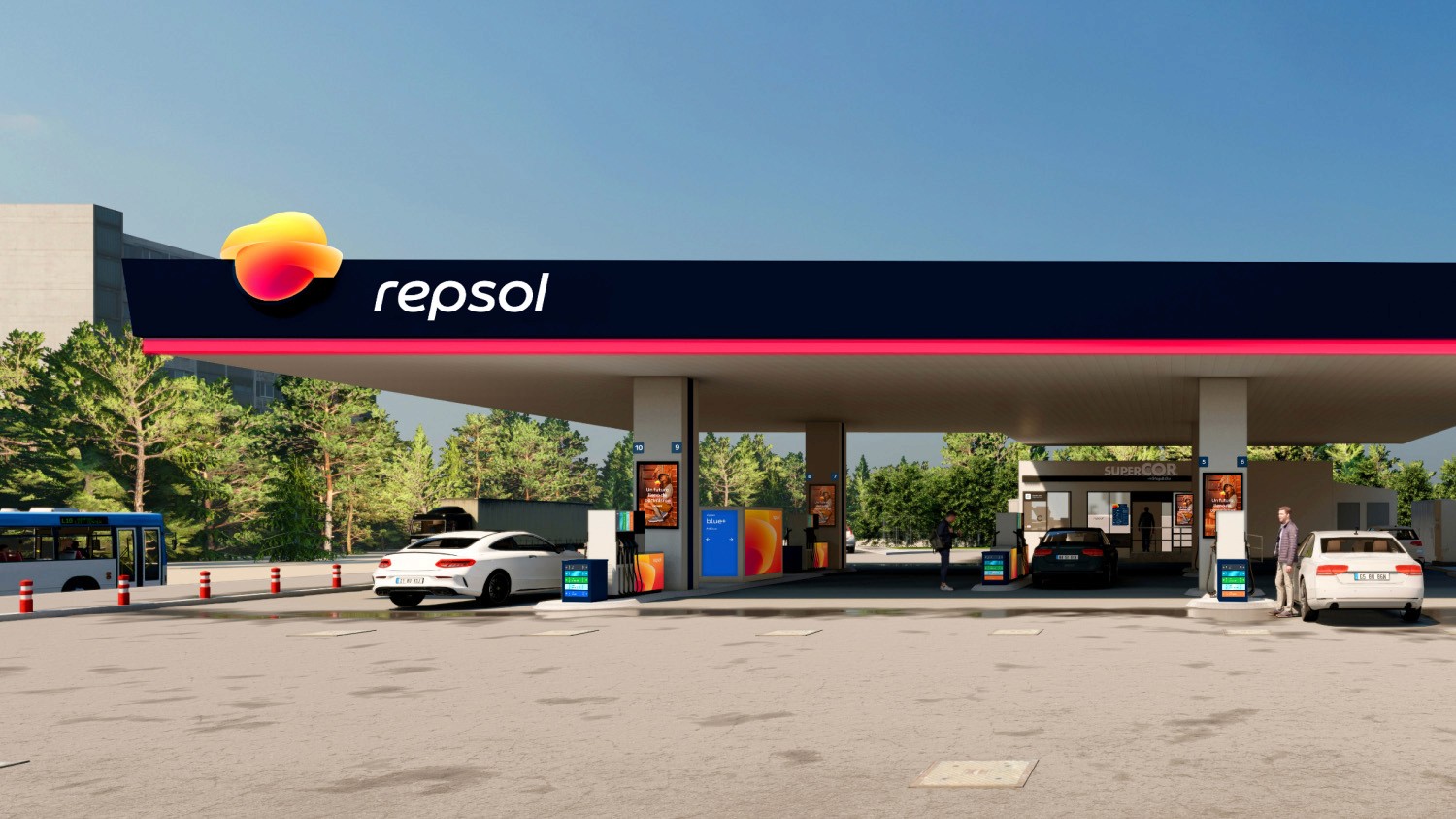
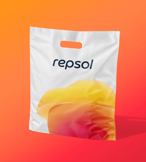
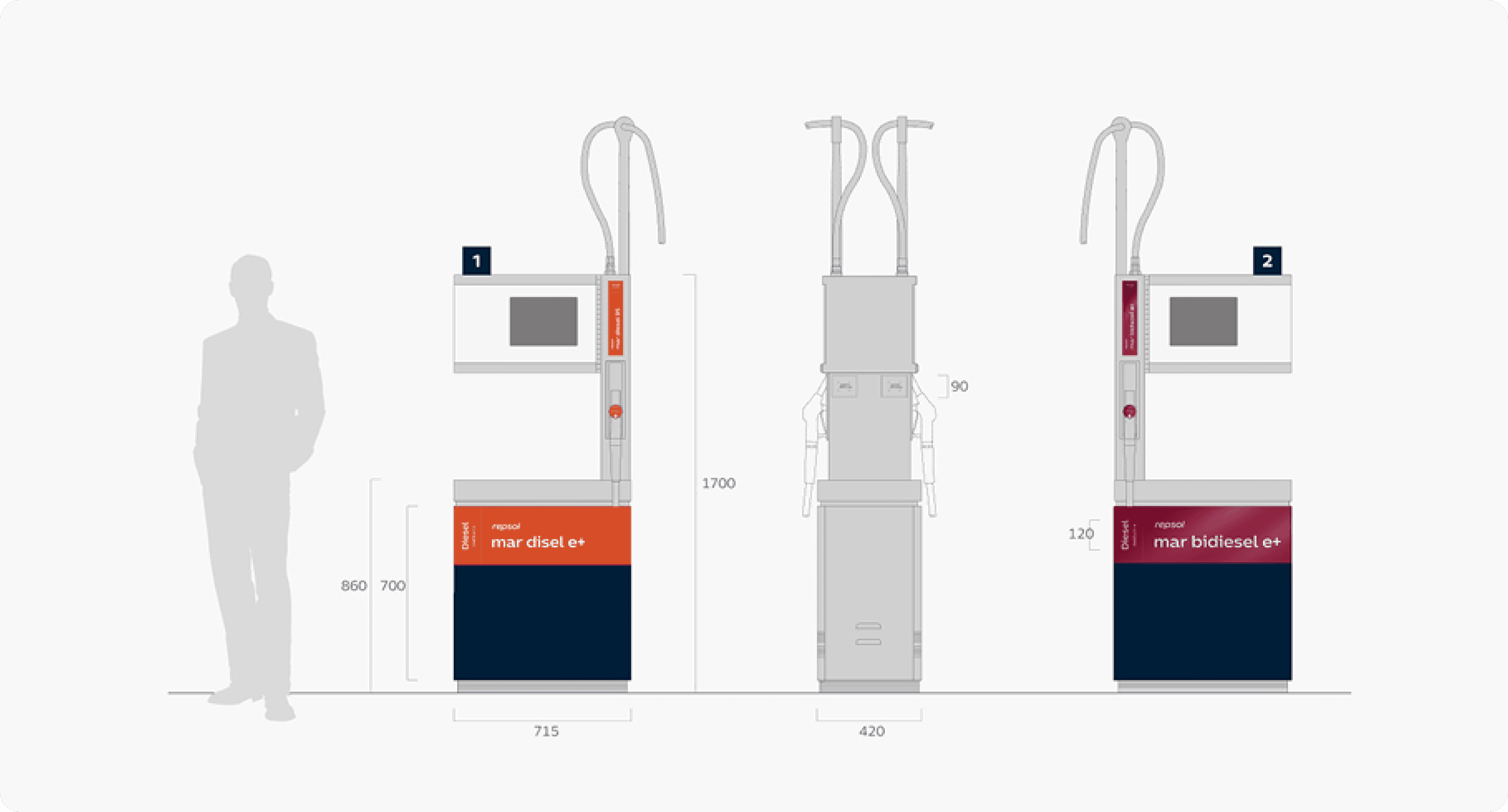
Repsol is Spain’s leading energy provider and, in 2025, announced its brand refresh. Erretres was responsible for translating the identity into a graphic system across its entire 4,400 service stations.
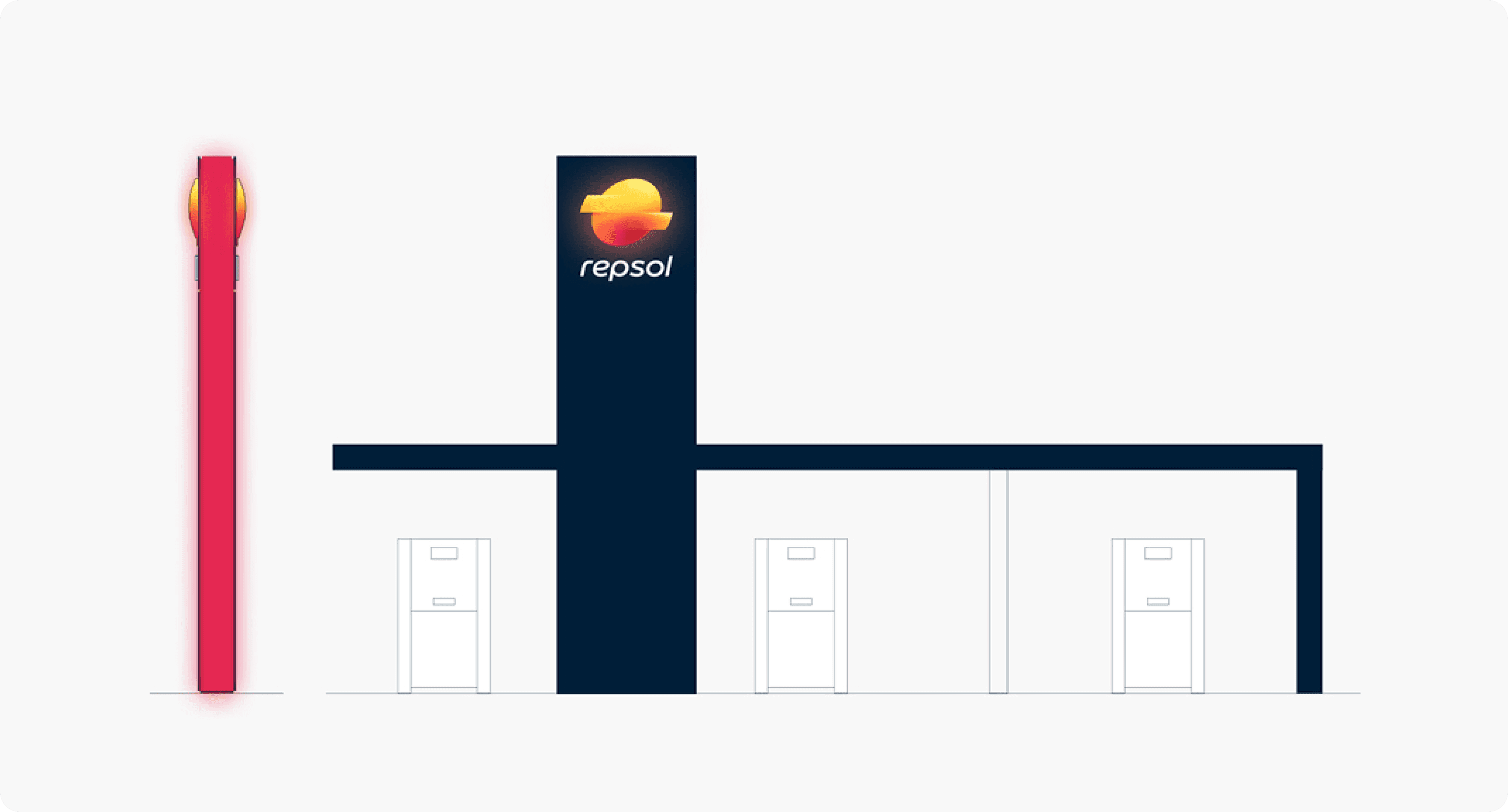
Given the scale of the project, a structured planning process was put in place from the outset, considering the overall system first and then scaling the implementation down to the design level.
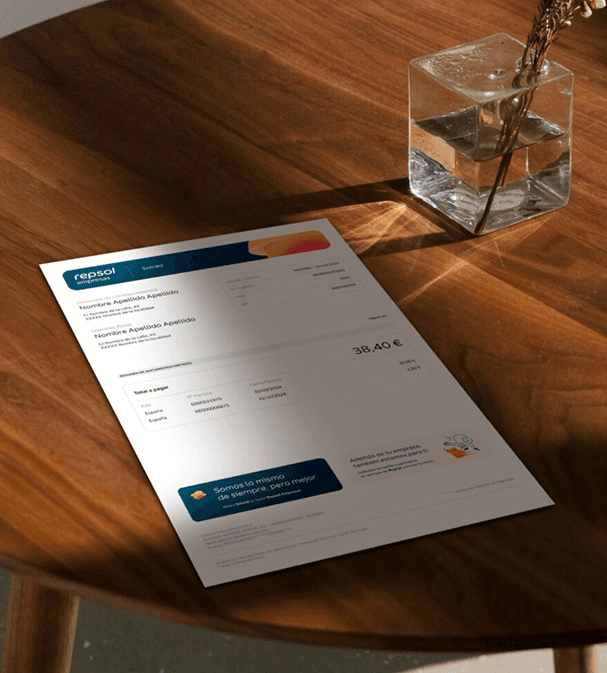
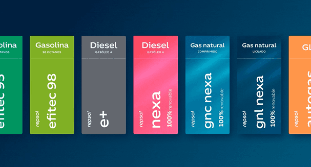
During the project, I contributed to the application of the brand across service stations elements such as pump islands, monoliths, fuel labels, signage, car wash stations, loyalty cards, invoices and more.
Repsol es el principal proveedor de energía de España, en 2025 decidió anunciar su cambio de marca. Erretres fue la encargada de la bajada gráfica de la identidad en toda su red de estaciones de servicio.
Debido a la gran escala del proyecto se llevó a cabo una planificación estructurada que consideraba desde un inicio la vista global del conjunto, escalando la implementación hasta llegar al diseño.
Durante el proyecto contribuí en la bajada de la marca en estaciones de servicio a través de: góndolas, monolitos, etiquetas de carburantes, señalética, estaciones de autolavado, tarjetas de fidelización, facturas, etc.

Seedtag
Seedtag
2026 · DESIGNED AT ERRETRES
2026 · DESIGNED AT ERRETRES
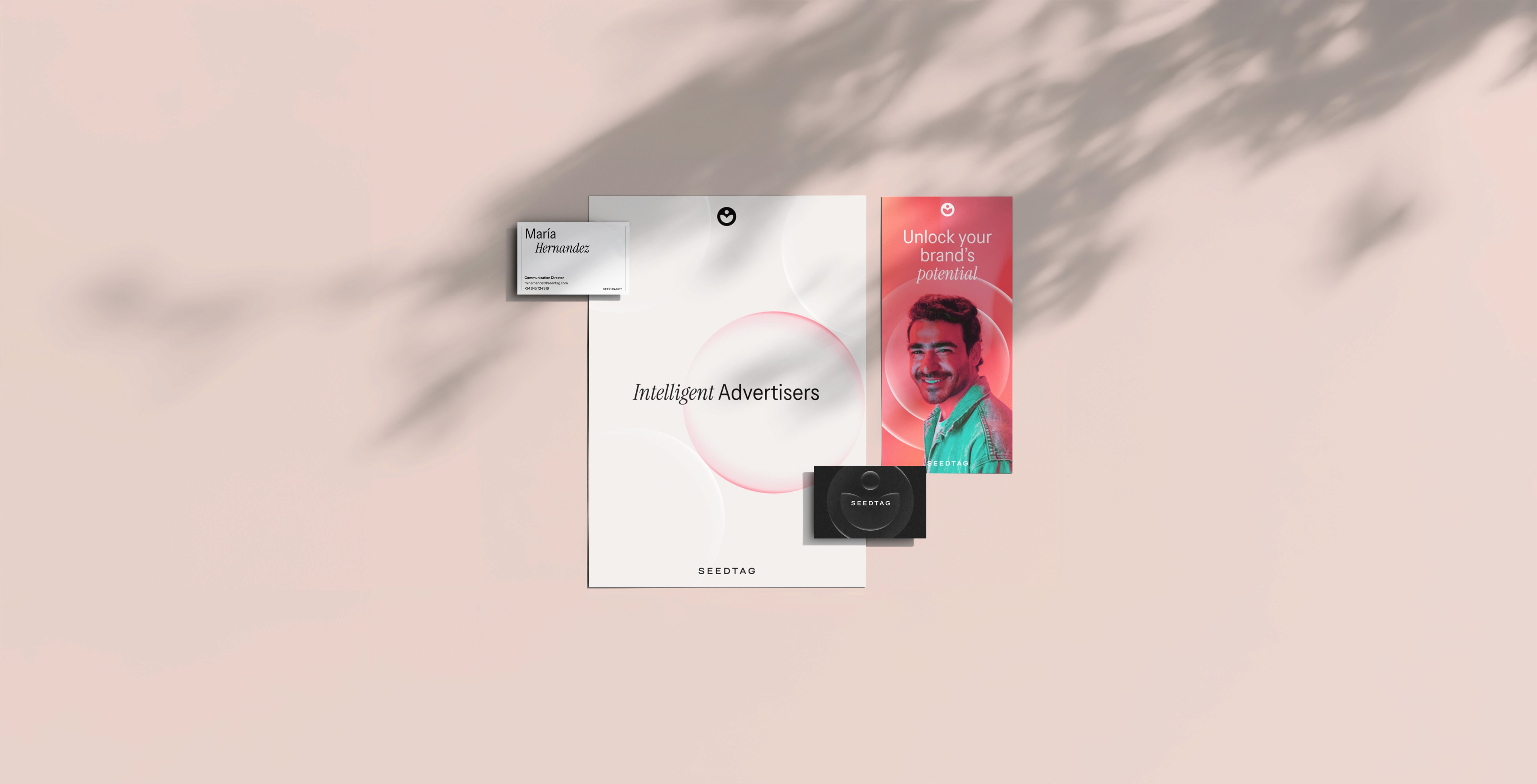
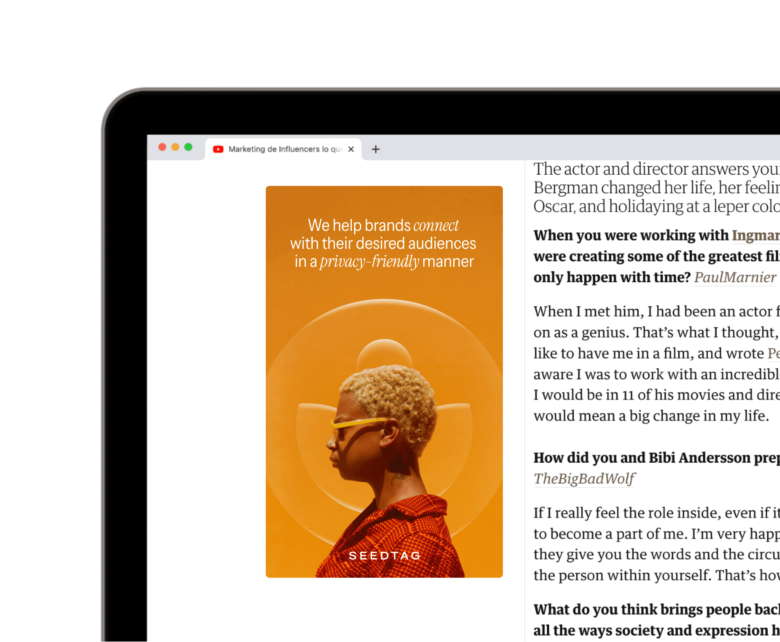
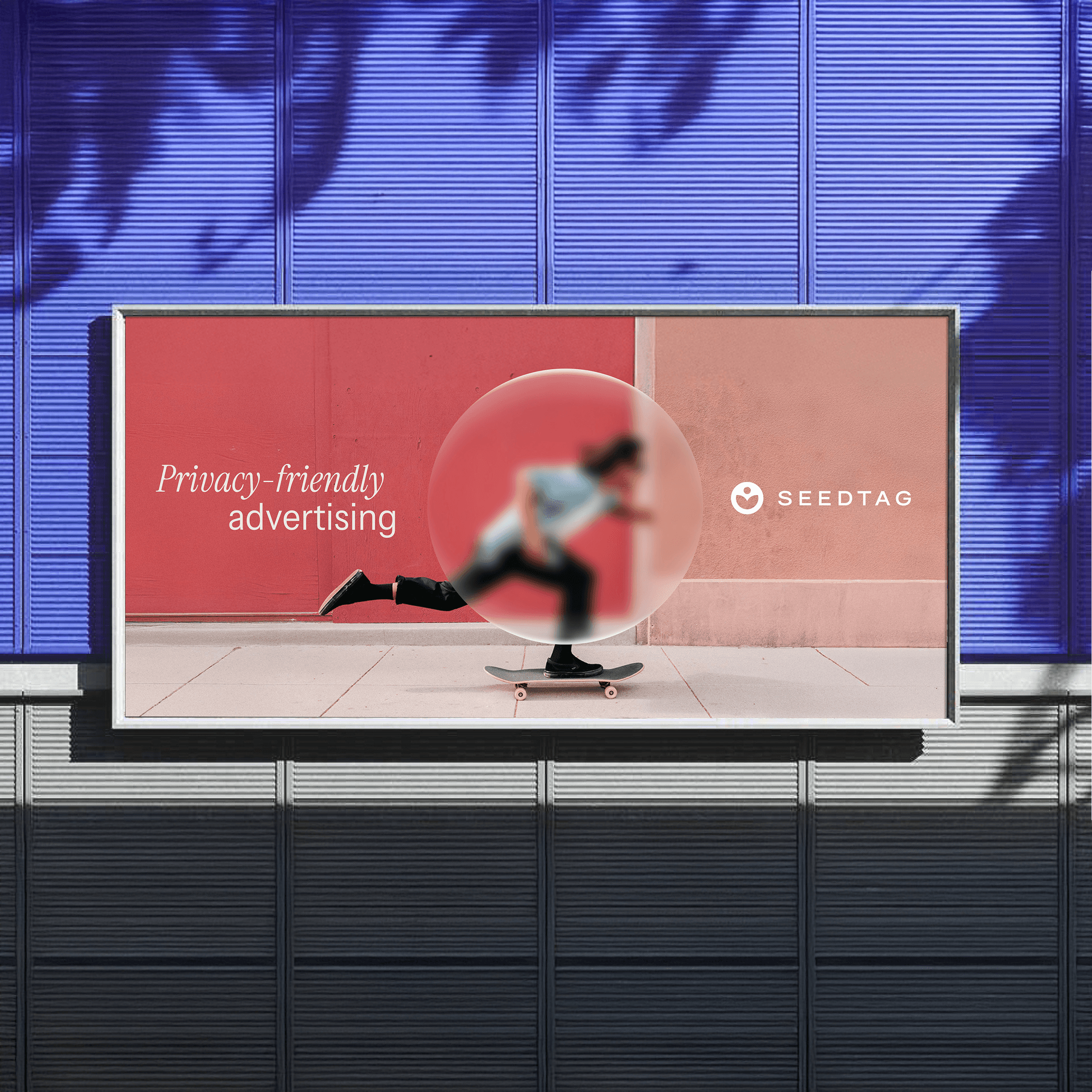
Seedtag is the global leader in contextual advertising, a technology that analyses digital context without collecting user data, thereby prioritising privacy.
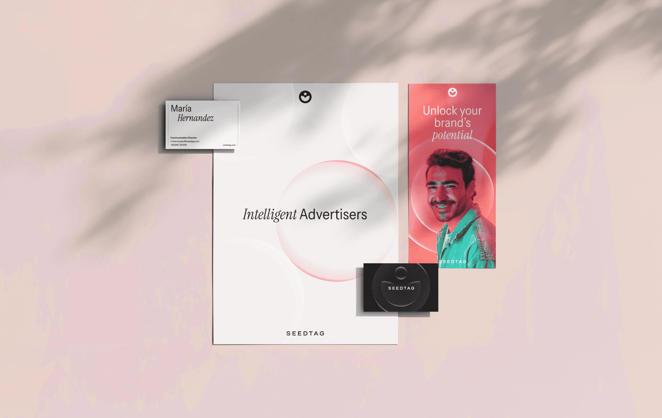
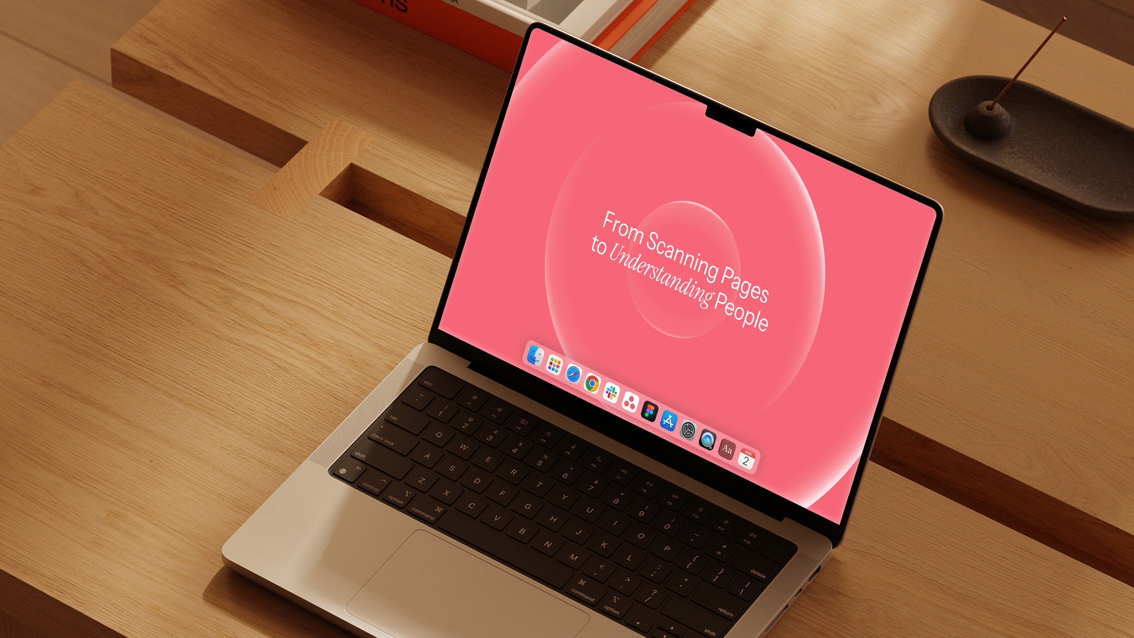
After it reached unicorn status the company entered a new stage shaped by renewed leadership and a stronger focus on artificial intelligence a new brand was needed. The new identity explores the concepts of transparency and privacy through a system of “lenses”.
I was actively involved in every stage of the brand development process, from research and analysis, reference exploration, definition of creative routes, two identity proposals, branded assets, and a storyboard for their brand video.
Seedtag es una empresa global líder en publicidad contextual, una tecnología que analiza el contexto digital sin recopilar datos de usuario, priorizando así la privacidad.
Tras convertirse en unicornio y abrir una nueva etapa marcada por una dirección renovada y un mayor enfoque en la inteligencia artificial, la compañía decidió renovar su marca. La nueva identidad explora los conceptos de transparencia y privacidad mediante un sistema de “lentes” que refleja los valores esenciales de la marca.
Participé activamente en todas las fases del desarrollo de marca, desde investigación y análisis, búsqueda de referencias y definición de líneas creativas, 2 propuestas de identidad, desarrollo de aplicaciones de marca, storyboard de vídeo de marca, AAFF.

Zena
Zena
2025 · DESIGNED AT ERRETRES
2025 · DESIGNED AT ERRETRES
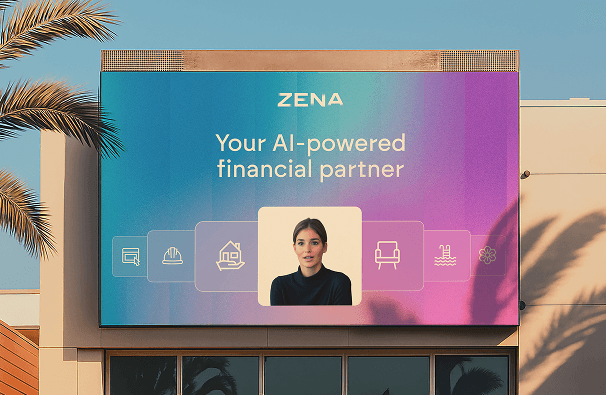
Zena is a San Francisco-based startup that aims to simplify small business management through artificial intelligence.
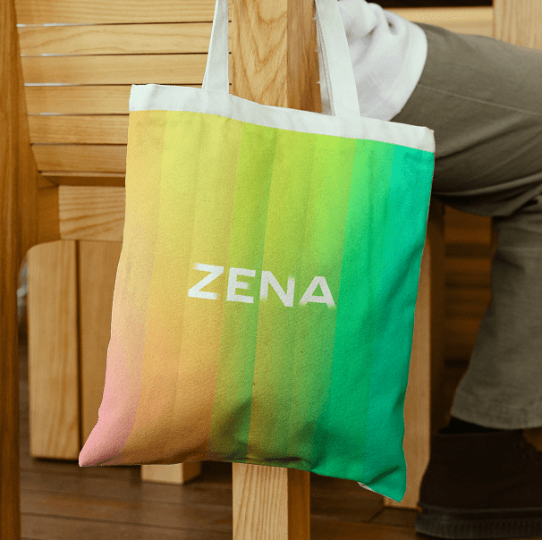
For its visual universe, we built a system based on a glass that reflects different colours, symbolising the diversity of entrepreneurs using the platform.
My role in the project was to support the digital team in a fast-paced collaboration, working as one team on the creation of mockups, AI image generation, branded assets, motion graphics and other key elements of the system.
Zena is a San Francisco-based startup that aims to simplify small business management through artificial intelligence.
For its visual universe, we built a system based on a glass that reflects different colours, symbolising the diversity of entrepreneurs using the platform.
My role in the project was to support the digital team in a fast-paced collaboration, working as one team on the creation of mockups, AI image generation, branded assets, motion graphics and other key elements of the system.

International Space Exploration Alliance (ISEA)
International Space Exploration Alliance (ISEA)
2025 · PERSONAL PROJECT
2025 · PERSONAL PROJECT
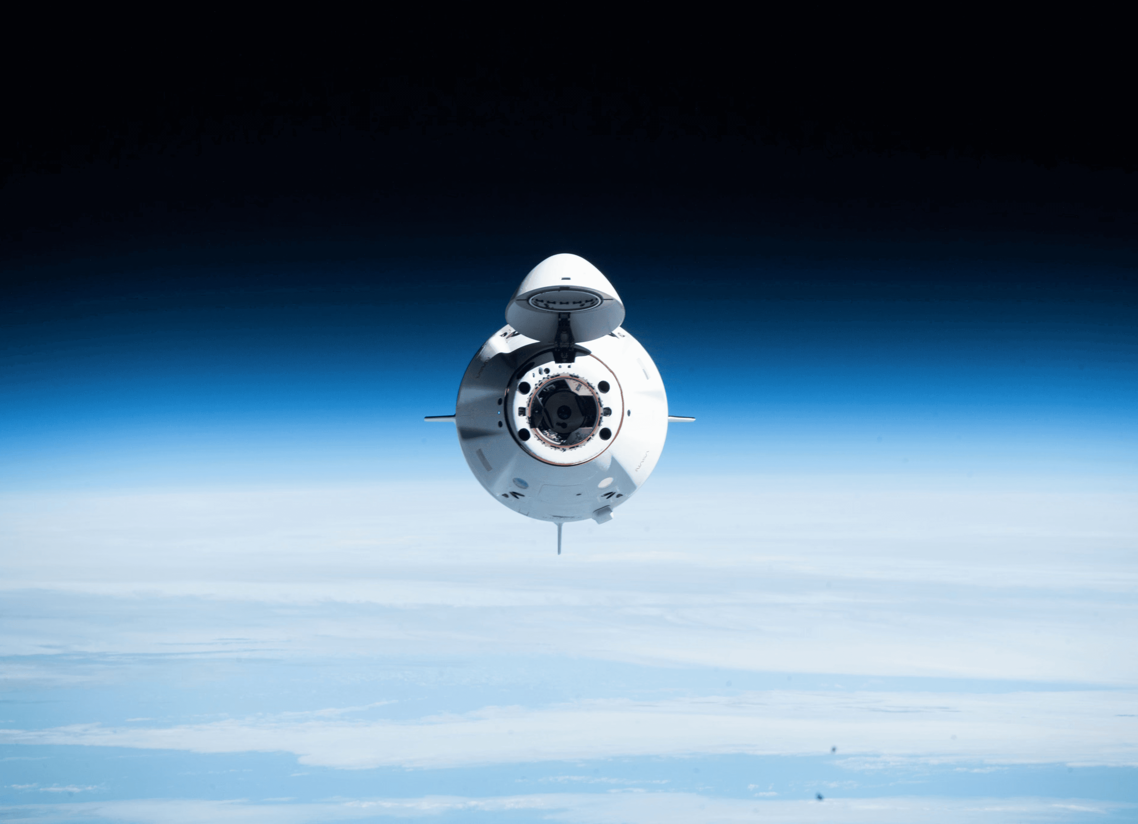
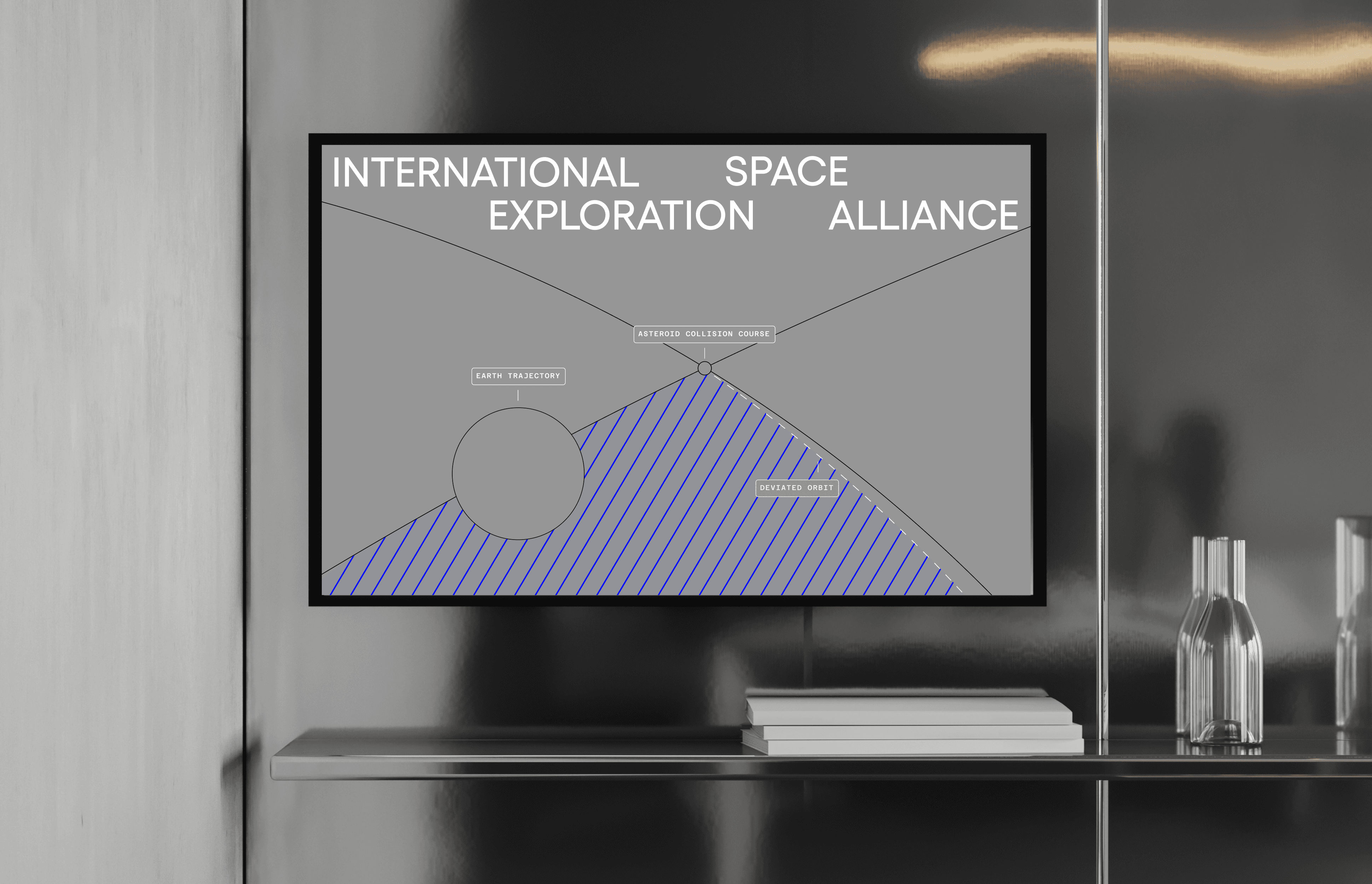
The space race has awakened once again. New players, private companies and technologies are competing to conquer what does not yet belong to anyone.
To avoid repeating colonial mistakes of the past, a need to defend space as a shared heritage of humankind arises.
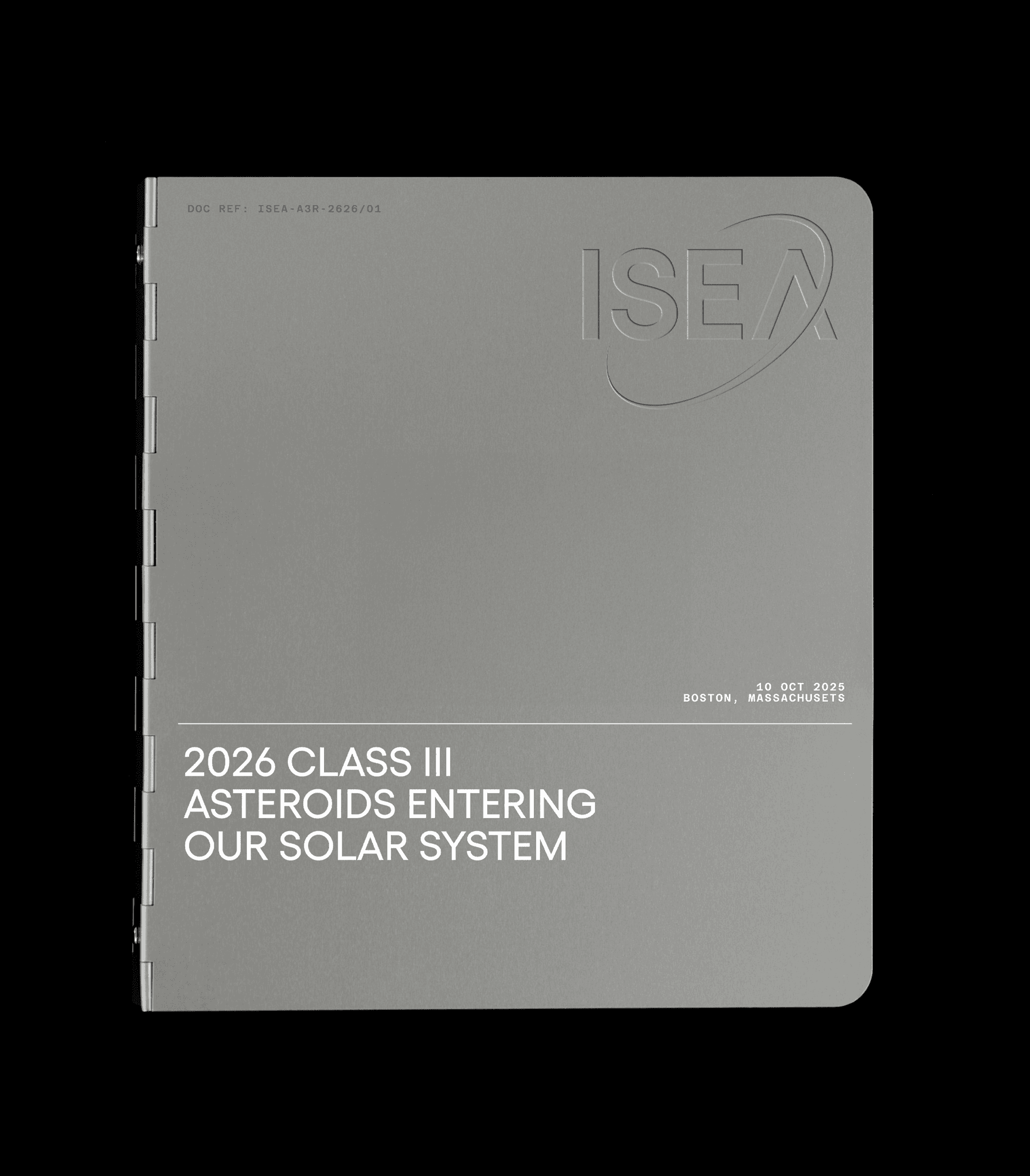
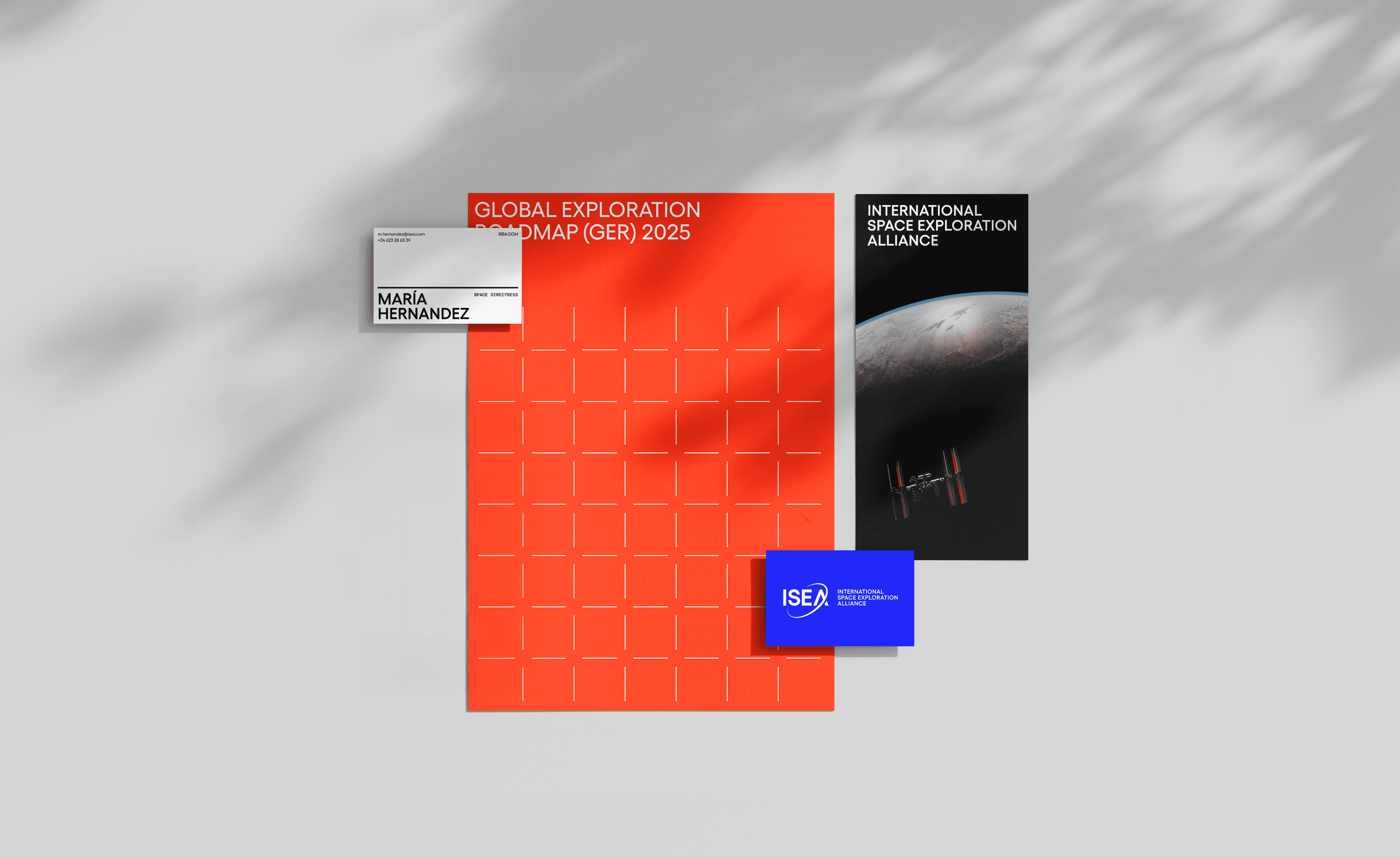
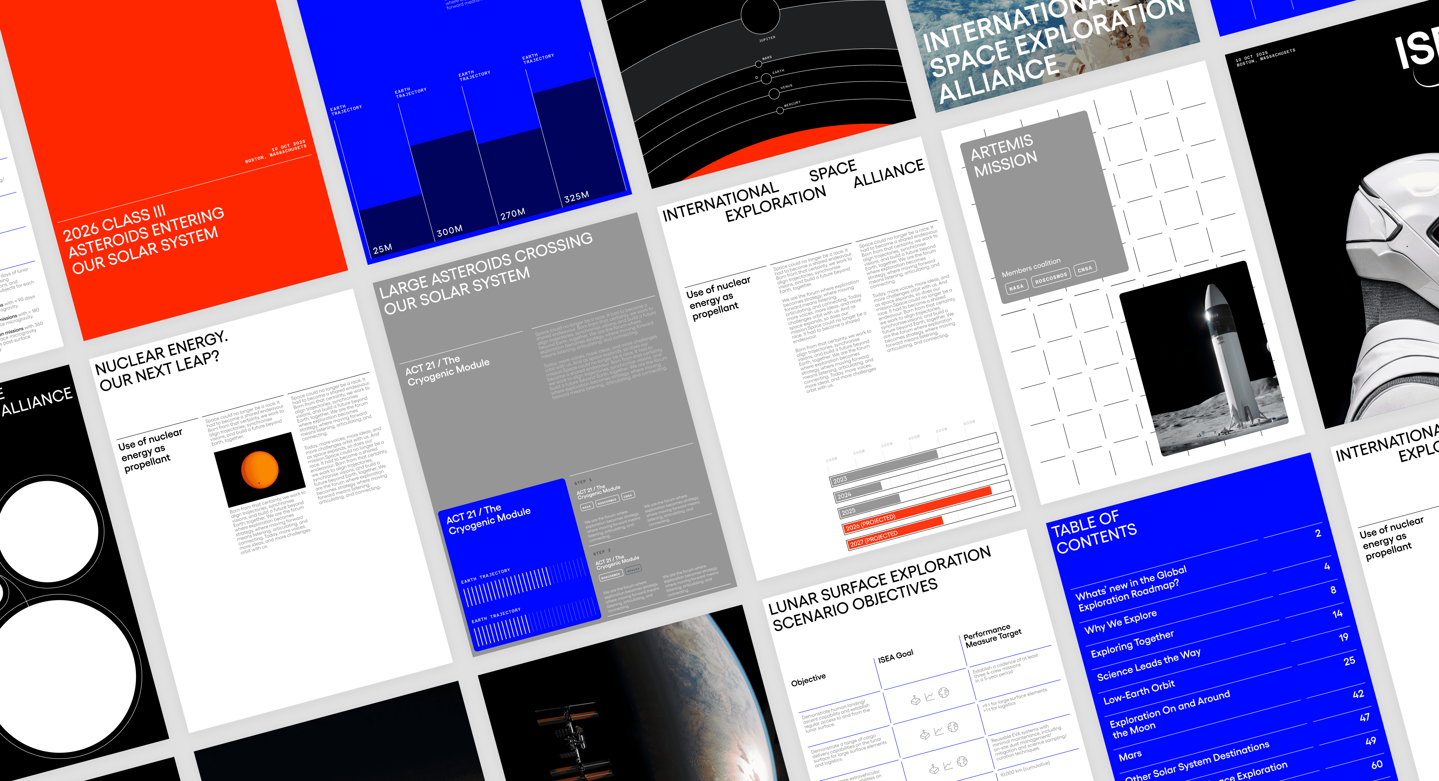
This project proposes a comprehensive rebrand of ISECG, an existing organisation that coordinates international space exploration.
This full-branding project spans strategy, naming, visual and verbal identity, resulting in a new brand that gives the organisation an ambitious identity to equal its purpose.
La carrera espacial ha vuelto a despertar. Nuevas potencias, empresas privadas y tecnologías compiten por conquistar lo que aún no tiene dueño.
Para evitar repetir errores coloniales del pasado surge la necesidad de defender el espacio como un patrimonio compartido de la humanidad y emprender la exploración espacial como una labor compartida.
Este trabajo plantea un rebranding integral de ISECG, una organización existente que coordina la exploración espacial internacional. Este fullbranding comprende estrategia, naming, identidad visual y verbal, resultando en una nueva marca que dota a la organización de una identidad a la altura de su propósito.


Tres Tombs
Tres Tombs
2024 · UNIVERSITY PROJECT
2024 · UNIVERSITY PROJECT
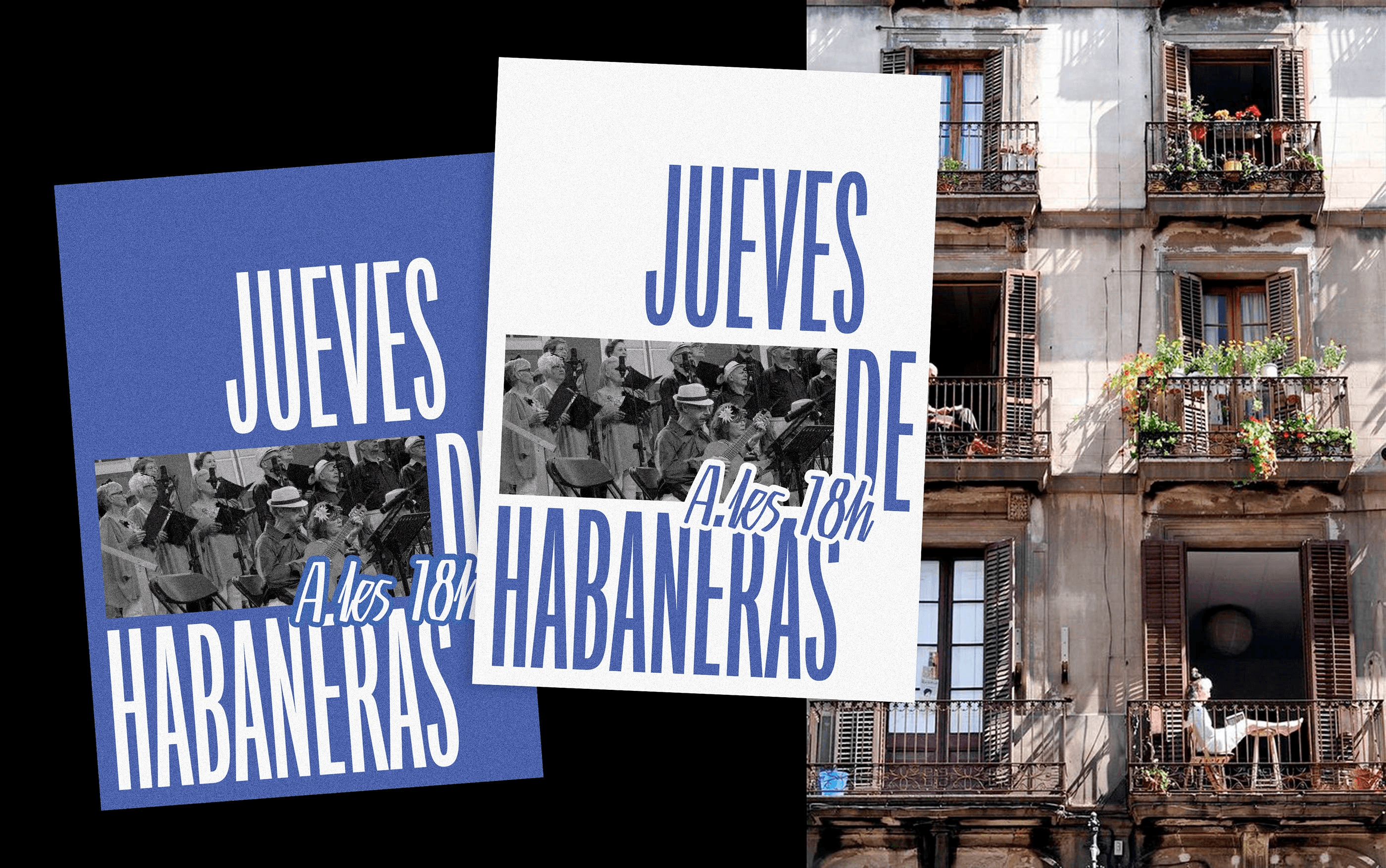
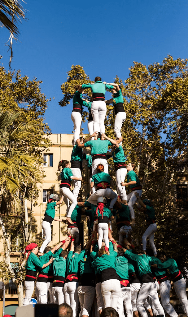
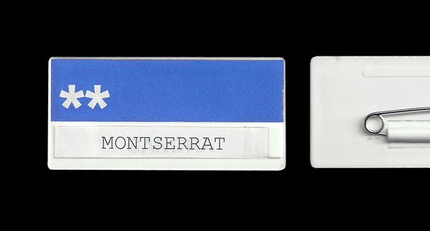
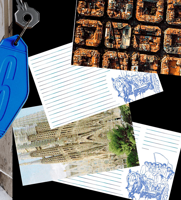
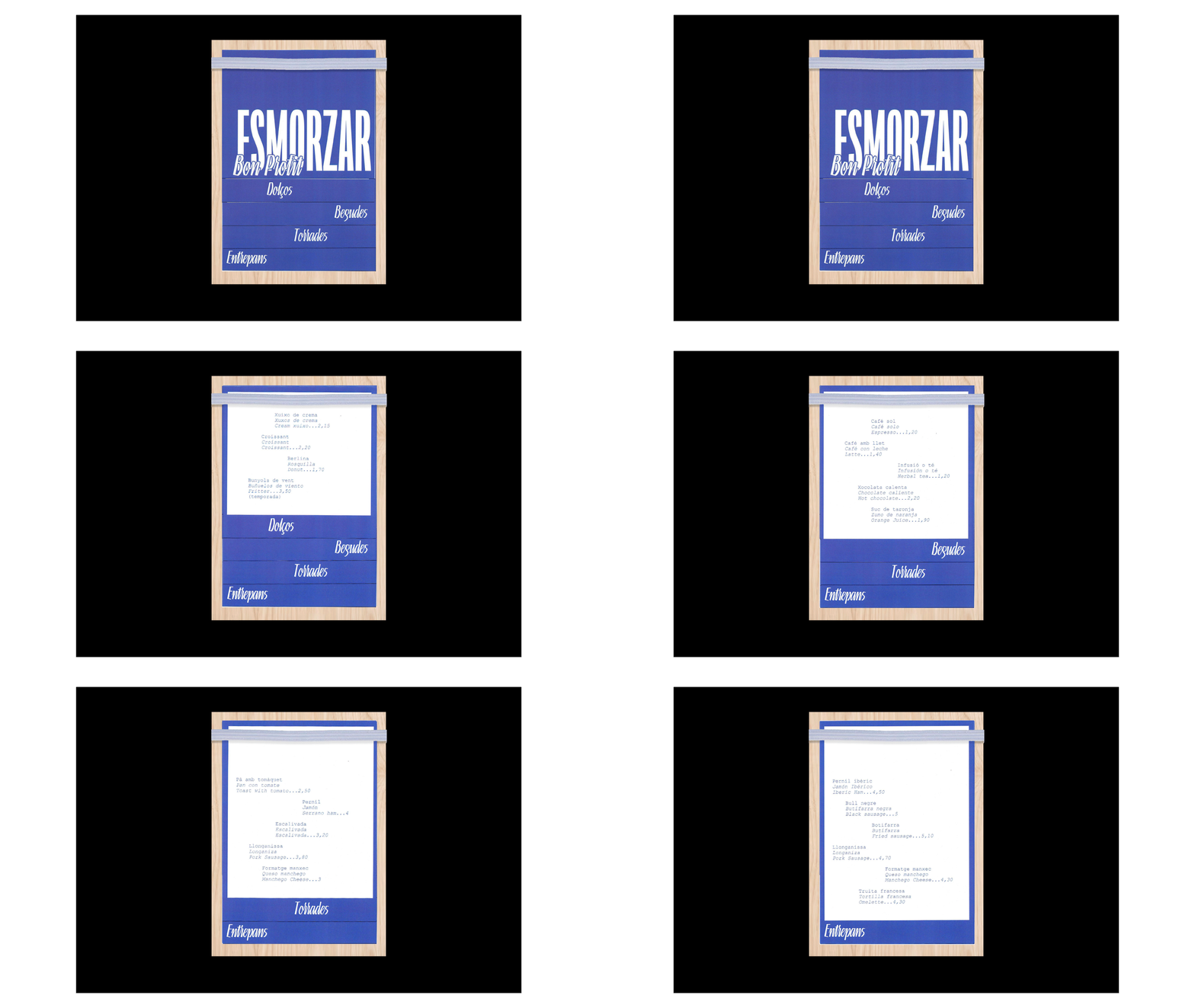
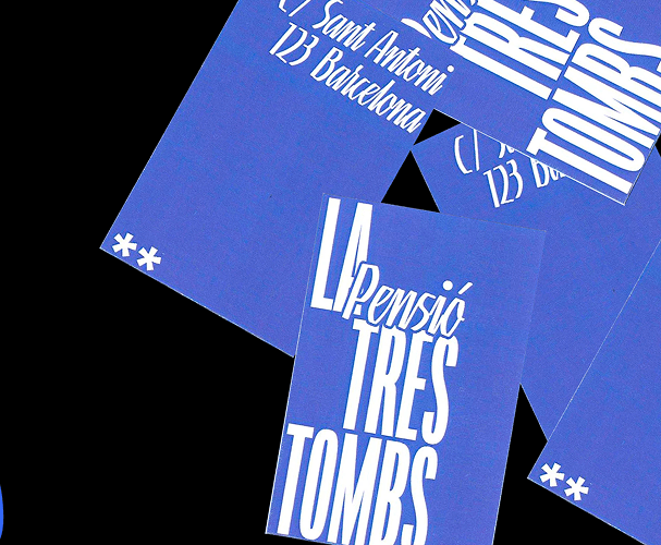
In a world dominated by Airbnbs, the concept of the traditional guesthouse has started to disappear. Born from the need to revitalise this ancient model of travel, "La Tres Tombs" is a traditional guesthouse in Barcelona that aims to bring Catalan culture closer to its guests.
To do so, the identity adopts and reinterprets visual cues from Spanish guesthouses of the 1940s and 1950s. The result is a fresh, simple, approachable yet familiar identity.
En un mundo dominado por Airbnbs el concepto de pensión deja de existir. De esta necesidad de revitalizar este modelo de viajas nace "La Tres Tombs", una pensión tradicional Barcelona que pretende acercar la cultura catalana a sus huéspedes.
Para ello la identidad adopta y reinterpreta códigos propios de las pensiones de los años 40 y 50 en España. Resultando una identidad fresca, sencilla, cercana y familiar.
WAM
WAM
2026 · DESIGNED AT ERRETRES
2026 · DESIGNED AT ERRETRES
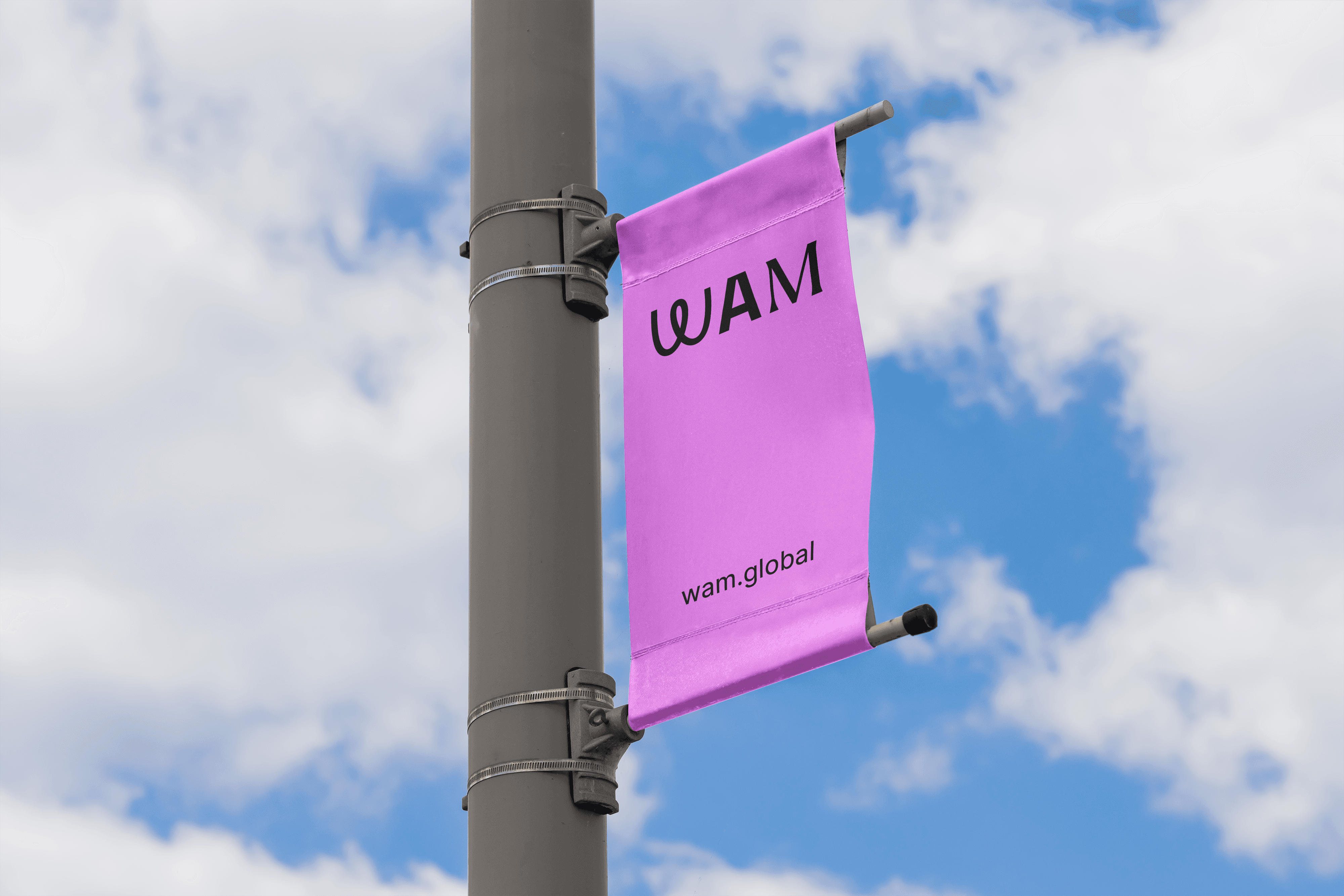
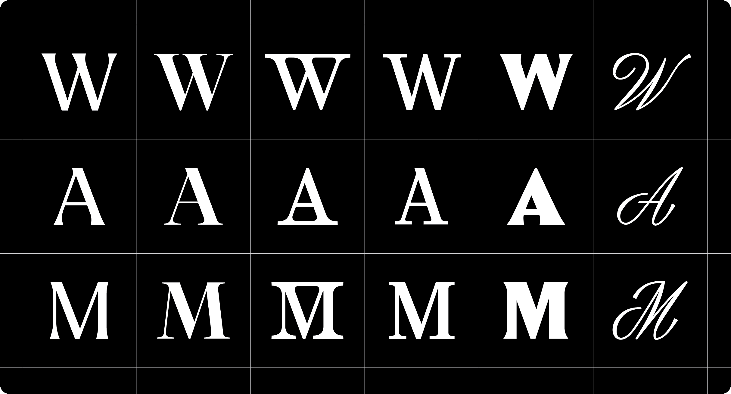
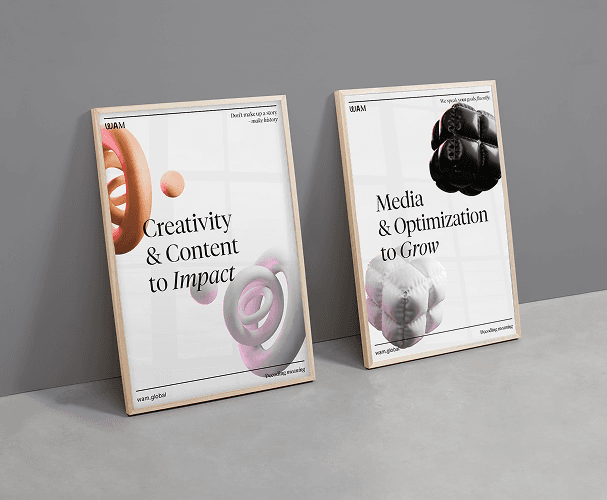
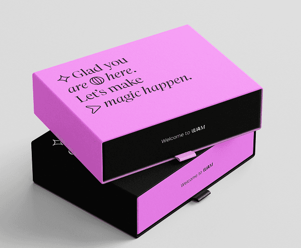
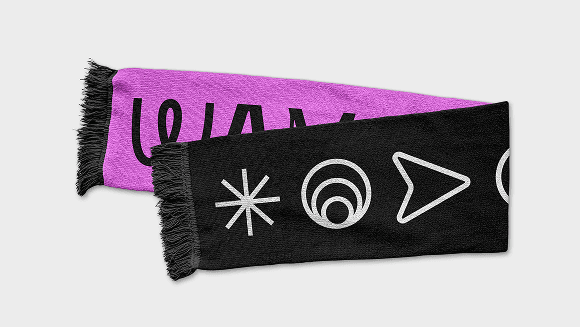
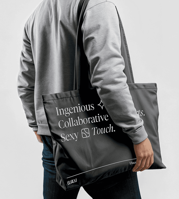
WAM is a global marketing and technology studio that after several acquisitions, significantly expanded its service offering. In this new stage, the company needed an identity capable of unifying all its capabilities.
The identity is built around a set of three-dimensional shapes and bespoke iconography which, combined with a striking colour palette, create a modular, versatile and recognisable visual language.
During the project, I contributed to the initial phases of research, analysis and benchmarking, as well as to the final stages of asset production and final artwork.
WAM es un estudio global de marketing y tecnología que, tras varias adquisiciones, amplió mucho su oferta de servicios. Con esta nueva etapa, necesitaban una identidad que unificara todas sus capacidades.
La identidad se articula a través de un conjunto de figuras tridimensionales e iconografía propia que combinadas con una paleta impactante crean un lenguaje visual modular, versátil y reconocible.
Durante el proyecto contribuí en las fases iniciales de investigación, análisis y benchmarking al igual que en las finales de realización de piezas y AAFF.
Jung
Jung
2026 · FREELANCE
2026 · FREELANCE
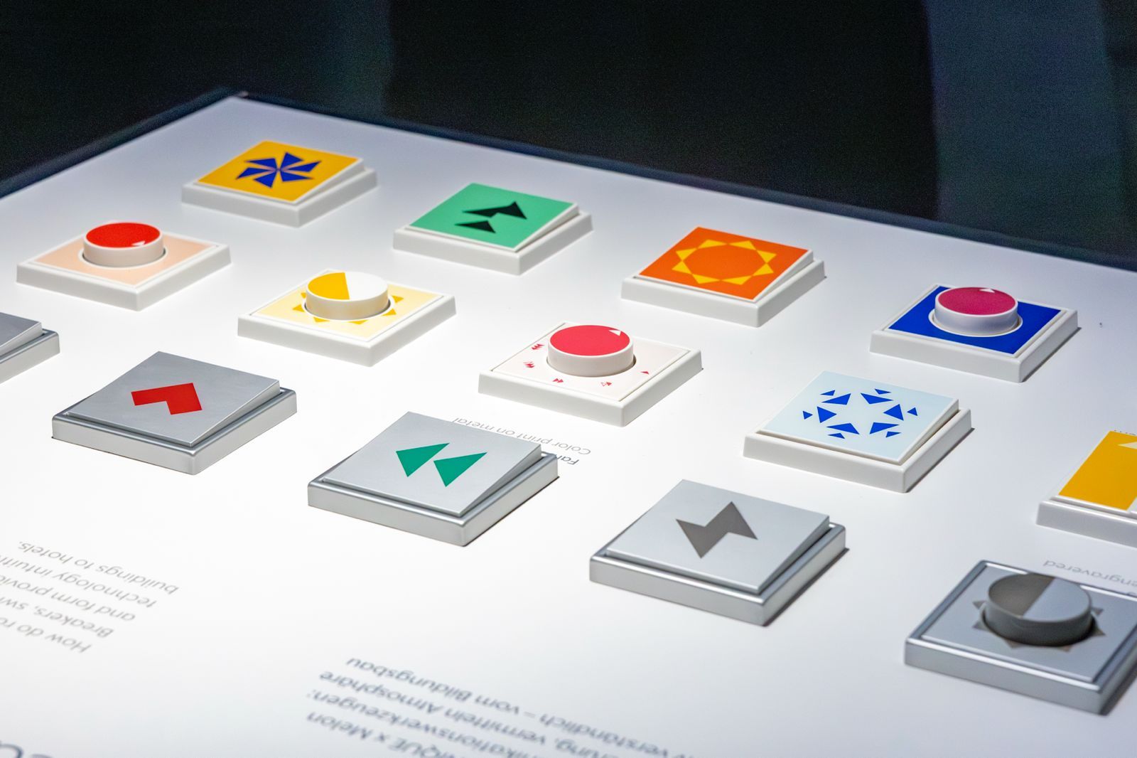
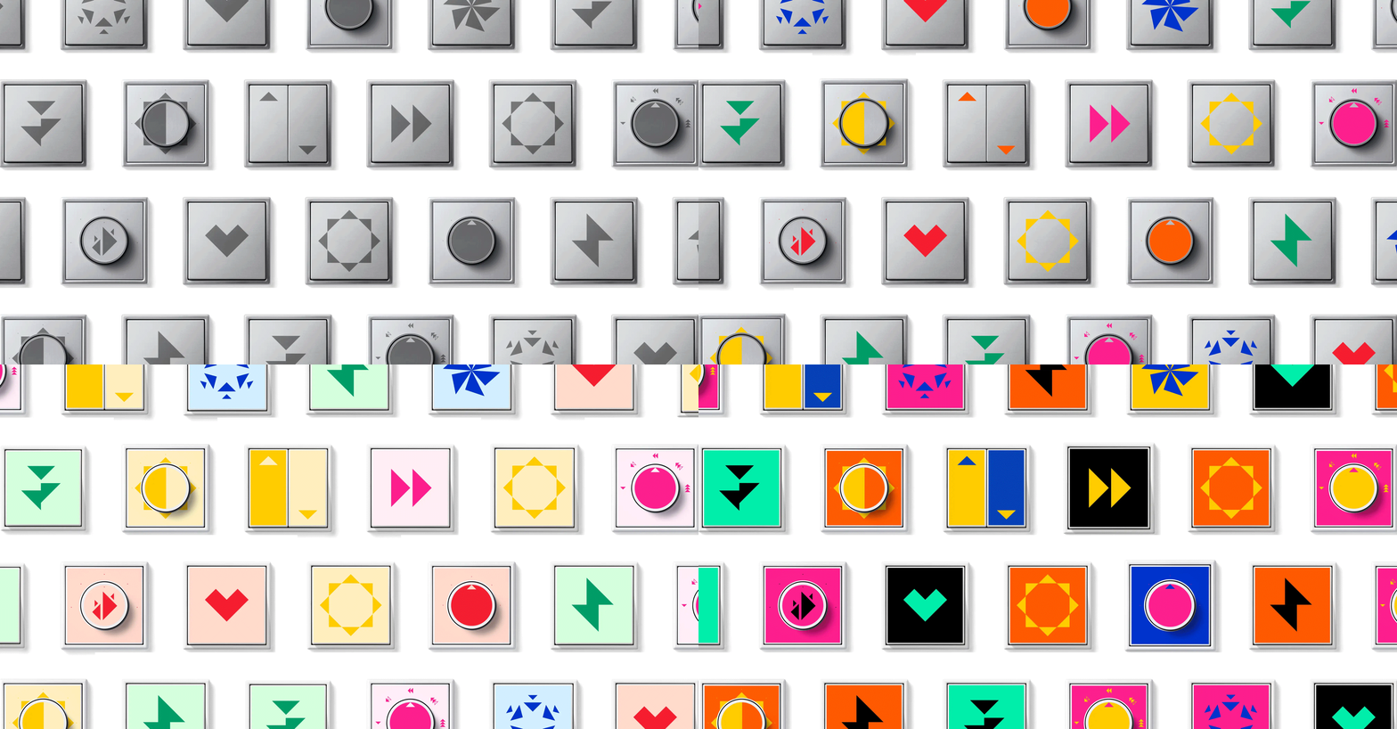
Jung is a German high-end electrical solutions company with more than a century of history. Every year they collaborate with designers, architects and interior designers to introduce new collections at the Light + Building fair in Frankfurt.
Together with Melon Breakers we created a children's collection inspired by the tangram. Using the triangle as the base unit, we built a simple visual grammar, scalable for audiences of any age. To modulate its intensity and character, the collection is deployed across four different colour variations.
Jung is a German high-end electrical solutions company with more than a century of history. Every year they collaborate with designers, architects and interior designers to introduce new collections at the Light + Building fair in Frankfurt.
Together with Melon Breakers we created a children's collection inspired by the tangram. Using the triangle as the base unit, we built a simple visual grammar, scalable for audiences of any age. To modulate its intensity and character, the collection is deployed across four different colour variations.